I have seen many “great” developers/designers talking about TABLE vs DIV(ision) tags. Most of them who consider themselves knowledgeable, aggressively believe that TABLE MUST NEVER be used. They even use DIV tag for tabular content/data! I think they are lacking proper knowledge of CSS and HTML. Let’s see how.
A brief history first: TABLE vs DIV battle was started when designing and CSS was in very early stage. Many developers/designers were using TABLE for designing structure/layout of HTML page. In a table, there were mainly 3 rows. In the first row, header (logo and main navigation menu) part was written. In the second row, there were content part with optionally (primary (if not included in header)/secondary) navigation menu. And in the last row, there was footer (links to terms-of-use, privacy-policy, contact-details, copyright-notice, etc.) part. Now this whole structure/layout was done using TABLE tag which was obviously inappropriate.
However, now things have changed a lot. New CSS options are available since CSS v2.1 using which we can create TABLE like interface using DIV, and DIV like interface using TABLE. Although, still I am strongly against of using TABLE for designing page’s outer structure/layout.
Let’s see how to -and- how NOT to use table. (There should be FORM tags in the below examples, but I have omitted them for simplicity.)
How NOT to use table (very old style):
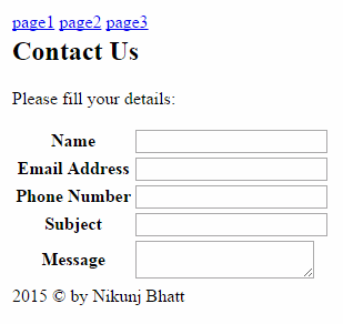
<body> <table> <tr> <td id='header'> <a href='page1.html'>page1</a> <a href='page2.html'>page2</a> <a href='page3.html'>page3</a> </td> </tr> <tr> <td id='content'> <h2>Contact Us</h2> <p>Please fill your details:</p> <table> <tr><th>Name</th><td><input name='name'></td></tr> <tr><th>Email Address</th><td><input name='email'></td></tr> <tr><th>Phone Number</th><td><input name='phone'></td></tr> <tr><th>Subject</th><td><input name='subject'></td></tr> <tr><th>Message</th><td><textarea name='message'></textarea></td></tr> </table> </td> </tr> <tr> <td id='footer'> <p>2015 © by Nikunj Bhatt</p> </td> </tr> </table> </body>
Output:

In the above example, outer TABLE tag is used to structure different parts of an HTML page. This must be avoided. Use DIV or new HTML5 tags, as mentioned in the below example to achieve the same.
How to use TABLE:
<body> <header> <nav> <a href='page1.html'>page1</a> <a href='page2.html'>page2</a> <a href='page3.html'>page3</a> </nav> </header> <main> <article> <h2>Contact Us</h2> <p>Please fill your details:</p> <table> <tr><th>Name</th><td><input name='name'></td></tr> <tr><th>Email Address</th><td><input name='email'></td></tr> <tr><th>Phone Number</th><td><input name='phone'></td></tr> <tr><th>Subject</th><td><input name='subject'></td></tr> <tr><th>Message</th><td><textarea name='message'></textarea></td></tr> </table> </article> </main> <footer> <p>2015 © by Nikunj Bhatt</p> </footer> <table> </table> </body>
Another way – how NOT to use TABLE:
<table>
	<tr>
		<td>
			<table>
				<tr><th>Name</th><td><input name='name'></td></tr>
				<tr><th>Email Address</th><td><input name='email'></td></tr>
			</table>
		</td>
		<td>
			<table>
				<tr><th>Phone Number</th><td><input name='phone'></td></tr>
				<tr><th>Subject</th><td><input name='subject'></td></tr>
			</table>
		</td>
	</tr>
	<tr>
		<td colspan='2'>
			<p><b>Message</b></p>
			<textarea name='message'></textarea>
		</td>
	</tr>
</table>
Output:

In the above example, to make the table compact, the form inputs are divided into 2 columns. However, it is good to make content compact and divide into multiple columns, but the way used here is not proper. Taking table into another table should be avoided for structuring layout.
Here is the proper way to make it look the same:
<div>
	<div style='float:left'>
		<table>
			<tr><th>Name</th><td><input name='name'></td></tr>
			<tr><th>Email Address</th><td><input name='email'></td></tr>
		</table>
	</div>
	<div style='float:left'>
		<table>
			<tr><th>Phone Number</th><td><input name='phone'></td></tr>
			<tr><th>Subject</th><td><input name='subject'></td></tr>
		</table>
	</div>
	<div style='clear:both'>
		<p><b>Message</b></p>
		<textarea name='message'></textarea>
	</div>
</div>
This is era of mobile browsing. Many are avoiding table because table messes the design when viewed in mobile. This happens because the TDs/THs of TRs tries to stay in their rows which results in condensed content. To avoid this, developers/designers are using DIVs for even tabular content. The above example can be displayed linearly in mobile browsers if just proper CSS is applied (yes, just CSS, without changing anything in the above HTML code), and this is not hard:
<style>
@media (max-width: 280px)
{	table, tr, th, td { display: block; }
}
</style>
By default TABLE, TR, TD, TH, THEAD, TBODY, TFOOT and other table related tags have their own special “display” types. The DIV tag has “block” as its display type; similarly TABLE has “table”, TR has “table-row”, TD & TH has “table-cell”, THEAD has “table-header-group”, TBODY has “table-row-group” and TFOOT has “table-footer-group” as their “display” type styles. So, the whole above table can be constructed without using any TABLE tag, or say with using any single/multiple tag(s) and by just applying appropriate CSS. Take the following 2 examples:
Designing table using multiple tags:
<div>
	<div style='float:left' class='table-inside'>
		<blockquote>
			<p><label>Name</label><span><input name='name'></span></p>
			<p><label>Email Address</label><span><input name='email'></span></p>
		</blockquote>
	</div>
	<div style='float:left' class='table-inside'>
		<blockquote>
			<p><label>Phone Number</label><span><input name='phone'></span></p>
			<p><label>Subject</label><span><input name='subject'></span></p>
		</blockquote>
	</div>
	<div style='clear:both'>
		<p><b>Message</b></p>
		<textarea name='message'></textarea>
	</div>
	</p>
</div>

<style>
div.table-inside blockquote { display: table; }
div.table-inside blockquote p { display: table-row; }
div.table-inside blockquote p label { display: table-cell; font-weight: bold; text-align: center; }
div.table-inside blockquote p span { display: table-cell; }
</style>
The above example is demonstrated using BLOCKQUOTE, P, LABEL and SPAN tags instead of using TABLE, TR, TH and TD respectively. Same way we can construct a table using only DIV tags:
<div>
	<div style='float:left'>
		<div class='table'>
			<div class='tr'><div class='th'>Name</div><div class='td'><input name='name'></div></div>
			<div class='tr'><div class='th'>Email Address</div><div class='td'><input name='email'></div></div>
		</div>
	</div>
	<div style='float:left'>
		<div class='table'>
			<div class='tr'><div class='th'>Phone Number</div><div class='td'><input name='phone'></div></div>
			<div class='tr'><div class='th'>Subject</div><div class='td'><input name='subject'></div></div>
		</div>
	</div>
	<div style='clear:both'>
		<p><b>Message</b></p>
		<textarea name='message'></textarea>
	</div>
	</p>
</div>

<style>
.table { display: table; }
.tr { display: table-row; }
.th, .td { display: table-cell; }
.th { font-weight: bold; text-align: center; }
</style>
So, I think now it should be clear in your mind that when and where to use TABLE and DIV tags, and when and where to avoid TABLE tag.


nice article. so conclusion is we should use table in way you suggested right?